Web design has undergone significant transformation since the advent of the internet. From the early days of table-based layouts to the modern, flexible designs powered by Flexbox and Grid, the journey of web design reflects technological advancements and changing user expectations. This article explores the evolution of web design, highlighting key milestones and the impact of each on the user experience and development processes.
The Era of Table Layouts
In the mid-1990s, web designers primarily used tables to create page layouts. This method, borrowed from print design, involved arranging content within HTML table elements, giving designers a way to control the placement of text, images, and other elements on a webpage. While effective, this approach had several drawbacks:
- Complexity and Maintenance: Table-based layouts required extensive use of nested tables, making the HTML code cumbersome and difficult to maintain.
- Accessibility Issues: Tables were not semantically appropriate for layout purposes, causing problems for screen readers and other assistive technologies.
- Limited Flexibility: Designing responsive layouts was nearly impossible, leading to websites that did not adapt well to different screen sizes.
Despite these challenges, table layouts were the norm until more sophisticated methods emerged.
The Rise of CSS and Div-Based Layouts
The introduction of Cascading Style Sheets (CSS) in the late 1990s revolutionized web design. CSS allowed designers to separate content from presentation, enabling more flexible and maintainable designs. The use of <div> elements, styled with CSS, gradually replaced table-based layouts. This shift brought several benefits:
- Cleaner Code: HTML became more semantic and easier to read, improving both development and accessibility.
- Greater Flexibility: CSS provided a range of layout techniques, including floats and positioning, which allowed for more complex designs.
- Improved Responsiveness: Media queries introduced in CSS3 enabled designers to create responsive layouts that adjusted to various screen sizes.
However, while div-based layouts were a significant improvement, they still had limitations, particularly regarding alignment and distribution of space.
The Advent of Flexbox
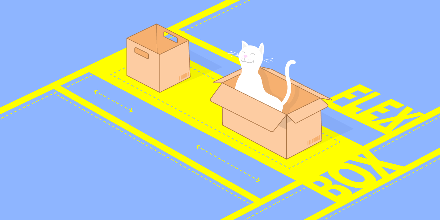
In 2009, the CSS Flexible Box Layout, commonly known as Flexbox, was introduced to address some of the limitations of previous layout methods. Flexbox is a layout model designed to distribute space along a single axis (either horizontally or vertically) and provides powerful alignment capabilities. Key features of Flexbox include:
- Simplified Alignment: Flexbox makes it easier to center elements both horizontally and vertically, a task that was notoriously difficult with previous CSS methods.
- Responsive Design: Flexbox allows for flexible and responsive layouts without the need for media queries, as it can adjust the size and position of items based on the available space.
- Order and Flexibility: Items within a flex container can be easily reordered and resized, providing greater control over the layout.
Flexbox quickly became a popular choice for modern web design, significantly simplifying the creation of complex and responsive layouts.
The Power of CSS Grid
The most recent major advancement in web layout is the CSS Grid Layout, introduced in 2017. CSS Grid allows designers to create two-dimensional layouts with rows and columns, providing unparalleled control over the design of complex web pages. Key advantages of CSS Grid include:
- Two-Dimensional Control: Unlike Flexbox, which is one-dimensional, Grid allows for precise control over both rows and columns, enabling complex and versatile layouts.
- Template Areas: Designers can define grid areas, making it easy to place elements in specific sections of the layout.
- Responsive Design: CSS Grid, in combination with media queries, provides powerful tools for creating responsive designs that adapt seamlessly to different screen sizes.
CSS Grid has been widely adopted, often used in conjunction with Flexbox to achieve the best of both worlds: Flexbox for simple, linear layouts and Grid for more complex, structured designs.
The evolution of web design from table layouts to Flexbox and Grid has been marked by a continuous quest for more flexible, maintainable, and responsive layouts. Each advancement has built on the lessons of its predecessors, leading to the sophisticated and user-friendly designs we see today. As web design continues to evolve, future innovations will likely build upon the foundations laid by these powerful layout systems, further enhancing the capabilities and aesthetics of the web.


