We’re living in 2026—a time when web design and development are evolving faster than ever before. With AI-powered tools, advanced frameworks, and increasingly intelligent workflows, the way we create digital products has fundamentally changed. The gap between design and development is shrinking, and the speed of innovation is accelerating daily.
Yet, despite all this progress, one outdated concept continues to linger in conversations, briefs, and feedback loops: “pixel perfect.”
It’s a term that once made sense—but today, it feels increasingly disconnected from reality. More importantly, it may be holding us back.
The Origins of a Rigid Idea
To understand why “pixel perfect” still exists, we need to go back to where it came from.
Long before responsive layouts and fluid interfaces, designers worked in a world of absolute control: print. Every detail—every dot of ink—had a fixed position on a physical page. There was no variation, no resizing, no unpredictability.
When early web design emerged in the late ’80s and ’90s, this mindset came with it.
Designers approached websites the same way they approached printed materials: as static compositions that needed to be replicated exactly. Tools like Photoshop and QuarkXPress were used to create precise layouts, and developers were expected to reproduce them perfectly in the browser.
And for a short time, that approach worked.
Back then, screens were relatively consistent. Most users had similar resolutions, and it was possible—at least in theory—to control how a website looked for everyone.
To achieve this, developers used techniques that feel almost absurd today: deeply nested table layouts, transparent spacer images, and rigid width constraints. The web was essentially “forced” into behaving like paper.
When the Web Started Pushing Back
The illusion of control didn’t last long.
As early as the 2000s, forward-thinking voices in the industry began challenging the idea of fixed layouts. They argued that the web wasn’t a static medium—it was fluid, adaptable, and inherently unpredictable.
Then came the real turning point: responsive design.
Once websites needed to function across multiple screen sizes, devices, and orientations, the idea of a single “perfect” layout became impossible to maintain. A design that looked flawless on one screen would inevitably break—or at least change—on another.
Still, the term “pixel perfect” refused to disappear.
It evolved, shifted in meaning, and became more abstract—but it never became more precise.
The Problem With “Pixel Perfect” Today
In today’s environment, the phrase isn’t just outdated—it’s problematic.
It Means Everything… and Nothing
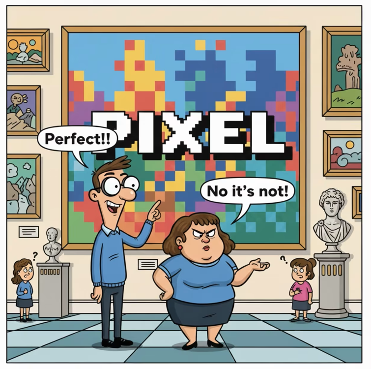
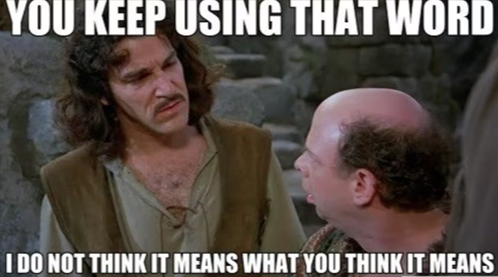
Ask five designers what “pixel perfect” means, and you’ll likely get five different answers.
Is it about spacing? Typography? Color accuracy? Alignment? Animations? Interaction states?
Or is it all of the above?
That’s the issue.
The term is so broad that it lacks any real technical clarity. It doesn’t define priorities, it doesn’t specify constraints, and it doesn’t guide implementation. Instead, it often becomes a vague expectation—something that sounds precise but actually isn’t.
In practice, saying “make it pixel perfect” is less of an instruction and more of a feeling.
Designing for a World Without a Fixed Canvas
One of the biggest shifts in modern web development is the disappearance of the “standard screen.”
Today, users access the web through an enormous variety of devices:
- smartphones with different resolutions and pixel densities
- tablets and laptops with varying aspect ratios
- ultra-wide monitors and foldable screens
- even spatial and immersive interfaces
Each of these environments renders content differently.
A layout that appears “perfect” on one device will inevitably adapt—sometimes subtly, sometimes dramatically—on another. That’s not a flaw. That’s the web doing exactly what it’s designed to do.
Trying to force a single, fixed version of “perfection” onto this ecosystem doesn’t just fail—it contradicts the very nature of the medium.
When Precision Still Matters
To be fair, there are areas where pixel-level precision is absolutely critical.
Things like icon design, sprite sheets, canvas rendering, and game interfaces often require exact alignment down to the pixel. In these cases, precision isn’t optional—it’s functional.
But these are specific technical scenarios, not a universal standard for all web interfaces.
Confusing these exceptions with general design practice is part of the problem.
A Better Way to Think About Perfection
If “pixel perfect” no longer serves us, what should replace it?
The answer isn’t abandoning quality—it’s redefining it.
Modern web design should focus on:
- consistency across contexts, not identical appearance
- clarity of hierarchy, rather than rigid spacing
- usability and accessibility, instead of visual rigidity
- adaptability, not control
Perfection in 2026 isn’t about freezing a design in place. It’s about creating systems that behave predictably, scale gracefully, and feel intuitive no matter where they’re experienced.
From Static Output to Living Systems
The biggest mindset shift is this: we are no longer designing fixed screens—we are designing systems.
These systems need to respond to user behavior, device capabilities, and environmental changes. They need to be flexible, resilient, and scalable.
This requires a different kind of thinking.
Instead of asking, “Does this match the mockup exactly?”
We should be asking, “Does this work well everywhere it needs to?”
That’s a much harder question—but also a much more valuable one.
Letting Go of Control to Gain Better Results
The idea of pixel perfection was born in a world where control was possible.
But today, control has been replaced by adaptability.
And that’s not a limitation—it’s an opportunity.
When we stop chasing exact replication and start focusing on experience, performance, and clarity, we build products that are not only more robust, but also more human.
The Future Isn’t Pixel Perfect—It’s Context Perfect
The web hasn’t lost its standards. It has evolved beyond rigid ones.
In a world of infinite screens and dynamic interfaces, perfection is no longer about pixels lining up—it’s about meaning, usability, and consistency across change.
So maybe it’s time to retire the phrase “pixel perfect.”
Not because precision doesn’t matter—but because the definition of perfection has grown far beyond it.